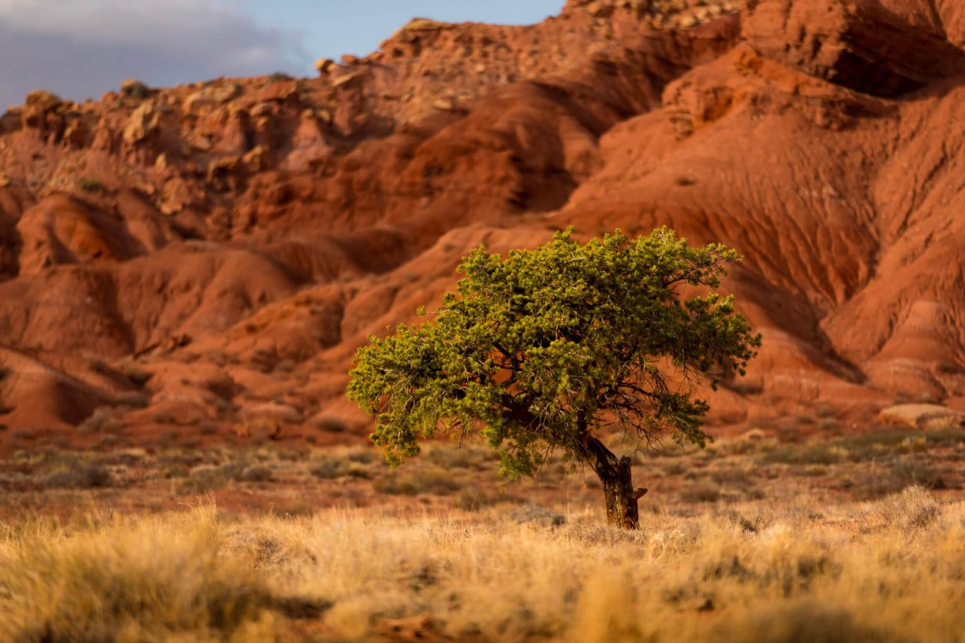
OK, I admit it- this is a cliche image: the isolated tree in a field. I could say this is a new take on that classic (cliched) image, and maybe I will because it makes me feel better. There are two things that I think make this image special. First is the colors, and second is the light. The colors are like this all over Capitol Reef, but are rather unique to there… so that makes it good. Second is the light. It made me hit the brakes, so there must have been something about the light.
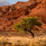 As I ran from the car to the position where I would make this image, my mind was already planing the shot. Heck, even before, because I had to grab the 70-200 before I left the car! But that is the way my mind works- I see the whole shot laid out in my head as I frame it up. So my thoughts- narrow depth of field and get the light- that was my goal.
So I got to the position I wanted, and knelt down- lower angle worked better to my mind. I am outdoors, so no reason at all to up the ISO, so I started the exposure equation with an ISO of 64. I had already thumbed the aperture down to 2.8, and I knew I would get a shutter of over 1/1000, so no tripod necessary.
I popped off a couple shots. It just seemed obvious to me that the tree had to be camera right weighted, because it reaches out to the left. I knocked out a couple of different framings, pretty much both ends of the zoom.
So I got home, and had two images. I finished both- tight on the tree, and the tree in it’s environment.This one was simple- contrast and color, a touch of sharpening, and its done.
I asked my daughter which she liked better and she said the wider one… and so that is the released version. What do you think? Would the tighter one have been better?
Prints of various sizes are available on the Fine Art America website, as well as the artists Pixel site (http://davekochphoto.pixels.com/) and the artists personal site (http://davekochphoto.com).

